A Feast Impending. Our Ruin to Come. It Becomes Symmetry (The Last War in Albion Book Two Part Thirty-Four: In Pictopia!)
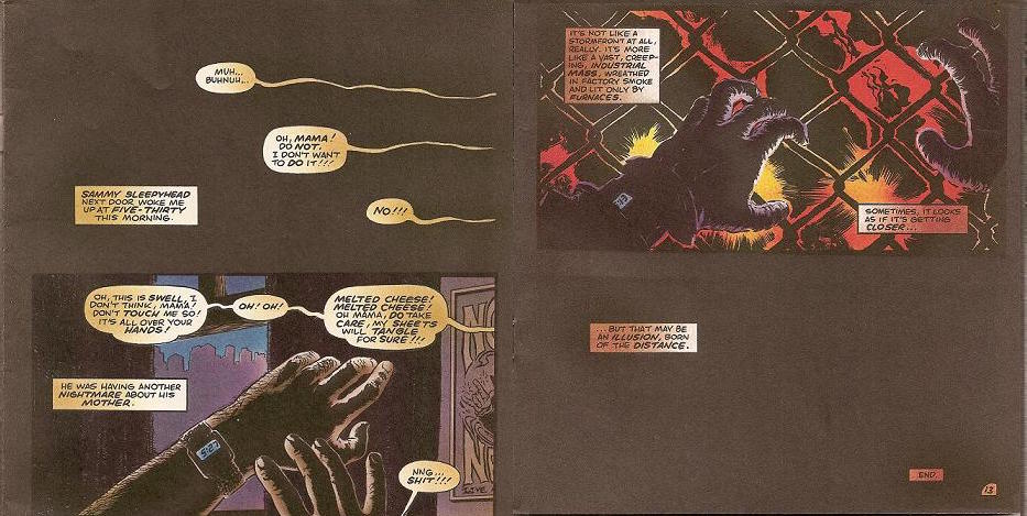 |
| Figure 969: Left: First two panels of “In Pictopia.” Right: Last two panels of “In Pictopia,” showing Moore’s characteristic elipticism. (Written by Alan Moore, art by Don Simpson and Eric Vincent, in Anything Goes #2, 1986) |
Previously in The Last War in Albion: Alan Moore wrote a short story called “In Pictopia” for a Fantagraphics charity anthology. We discussed a lot of implications of those last three words and never managed to get to the story itself.
In many ways, the story of “In Pictopia” is one of the strip constantly overperforming. Moore’s original commitment to Groth was two four-page strips, but he found the idea of “In Pictopia” too big to fit into such a small container, and ended up doing one eight-page script, although given that Simpson then expanded the script to thirteen pages, in terms of Moore’s short work it’s perhaps easiest to frame it as a forty-panel script, compared to his Future Shocks, which tended to have panel counts in the high twenties. And thinking of “In Pictopia” as a super-sized Future Shock is helpful, as Moore is using techniques he honed at IPC. The overall structure is typically elliptical – both the first and last panels feature captions over blackness, while the second and penultimate panels feature POV shots of the main character’s hands. And the overall story structure is what Moore describes as a “list” story, in which the plot mostly consists of taking a big concept and running through its most interesting implications in rapid succession – a style used for such 2000 AD classics as “They Sweep the Spaceways,” “Sunburn,” and “The Big Clock!”
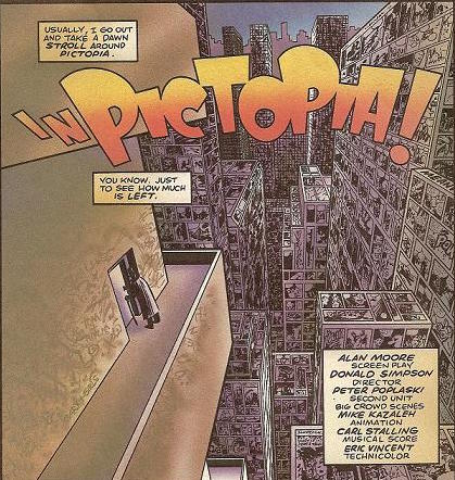 |
| Figure 970: The comic strip skyline of Pictopia. (In Anything Goes #2, 1986) |
But between Moore’s maturity as a storyteller and the space afforded by the increased panel count, “In Pictopia” goes to stranger and more unsettling places. Its conceit is the city of Pictopia, depicted on the title page as a collection of skyscrapers seemingly made up of comic panels, in which various comic strip characters live. The broad premise has antecedents – most obviously Gary K. Wolf’s 1981 novel Who Censored Roger Rabbit? – but as usual Moore’s angle on the material is unique. Wolf’s novel proposes that comic strips are actually photographs of the “toons,” while in Moore’s story, although the comic strips clearly exist (one character is introduced in terms of hers, and tenements are named after comic syndicates), there’s no clear sense of how the strips relate to characters’ day-to-day lives. Instead the sense is more that Pictopia is an early version of Ideaspace – a conceptual realm in which comic strip characters live, but that is ultimately created as a consequence of the real-world comics industry, its geography shaped and reshaped by industry trends – most notably when the Funnytown neighborhood (occupied by funny animals) is bulldozed because “this city’s changing, and some things just don’t fit the continuity no more.”
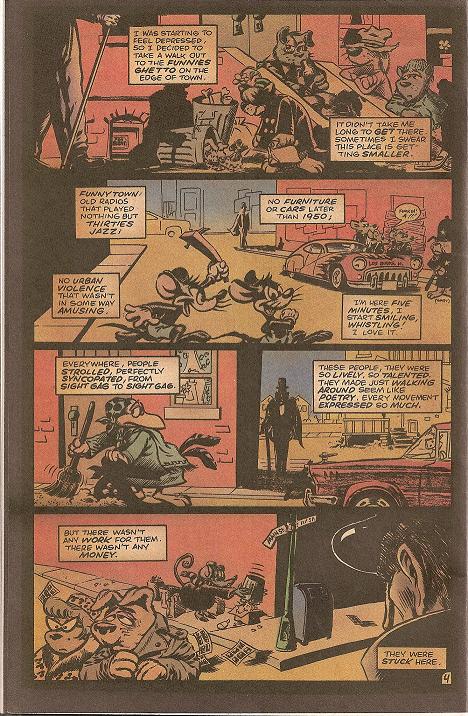 |
| Figure 971: Funnytown! (Written by Alan Moore, art by Don SImpson and Mike Kazaleh, from “In Pictopia” in Anything Goes #2, 1986) |
As this suggests, there’s an elegaic tone to “In Pictopia” in which Moore mourns the traditions and styles of comics that have waned and been neglected, and specifically that have been neglected in favor of superheroes, the only sorts of comics characters who can “afford to live in color,” as the narration puts it. His description of Funnytown is characteristic: “Funnytown! Old radios that played nothing but thirties jazz! No furniture or cars later than 1950! No urban violence that isn’t in some way amusing. I’m here five minutes, I start smiling, whistling! I love it. Everywere, people strolled, perfectly syncopated from sight gag to sight gag. These people, they were so lively, so talented. They made just walking around seem like poetry. Every moment expressed so much. But there wasn’t any work for them. There wasn’t any money. They were stuck here.” At one point, in the story’s most haunting sequence, a crowd of superheroes (specifically the “new people” that Flexible Flynn, a pastiche of Jack Cole’s Plastic Man, warns are moving into the city) tortures a dog from Funnytown, crowding around his prone body and kicking him repeatedly. “Mutilate a funny, and seconds later it’s healed completely. Often, they’ll let you disfigure them for a buck,” the narrator explains. “I felt sick and walked on quickly.”
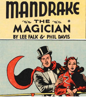 |
| Figure 972: Lee Falk’s Mandrake the Magician. |
The narrator is Nocturno the Necromancer, based on Mandrake the Magician created by Lee Falk in 1934. Mandrake is not the only comic strip character Moore riffs on – the strip opens with a parody of Little Nemo, and also features a version of Blondie, Red, who’s reduced to turning tricks while Deadwood is in rehab, seen bringing South-Sea Sullivan, a Popeye stand-in, back to her apartment. (In another of the story’s grimmer gags, Nocturno decides to pay Red a visit, only to discover her getting roughed up by some Judge Dredd lookalikes. “I am not a brave man,” he narrates. “I backed out, stammering, terrified, apologizing, trying not to meet Red’s terrorized, pleading eyes. She knew. She knew why I’d come to visit her.”) But Mandrake is a particularly savvy choice for a lead character. On the one hand he’s historically important – a strong argument exists that he’s the first comic book superhero. On the other, he’s largely an obscurity, overshadowed even within Falks’s own career by his later creation of the Phantom, and by 1986 more or less published by rote, propping up the bottom of the shrinking comics pages in fewer and fewer newspapers each year. He is, in other words, the perfect character to frame a story about the decline of a particular type of comic with – an important but never great figure in comics history who had demonstrably fallen on hard times.
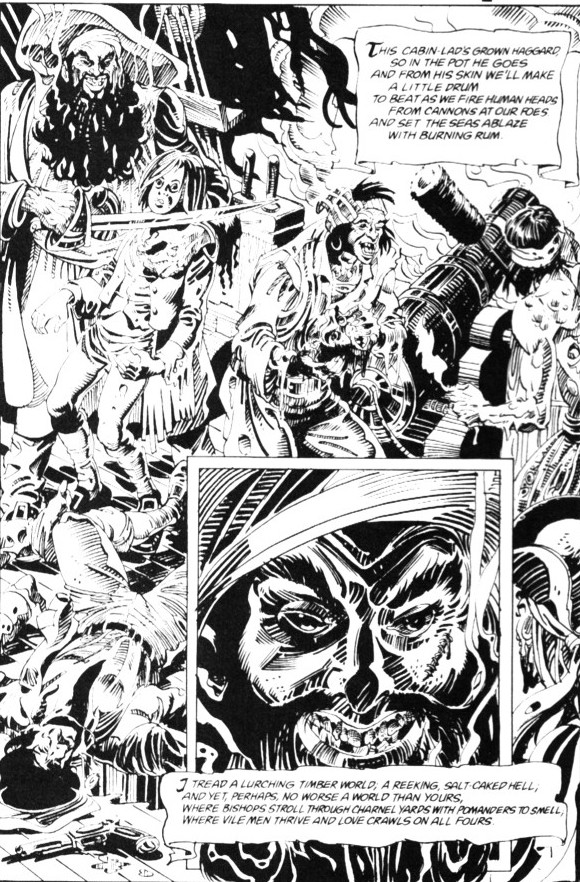 |
| Figure 973: Joe Orlando’s page of Tales of the Black Freighter. (Written by Alan Moore, from Watchmen #5, 1986) |
This sense of a fallen, faded fictional universe is, of course, shared with Watchmen, which “In Pictopia” coincided with, coming out in December 1986, the same month as Watchmen #7. The script appears to date somewhat earlier – Don Simpson’s recollections of what else he was working on at the time would have him drawing it in early 1986 – but is still firmly in the same period Moore was working on Watchmen. Perhaps the most obvious connection is to Tales of the Black Freighter, the pirate comic-within-a-comic that recurs throughout Watchmen, which Moore conceived of in the course of pondering what the comics industry might have done in a world where costumed adventurers, being real, held little interest for readers. And it is perhaps telling that, of the various background bits of the Watchmen setting, few were developed with the detail of Tales of the Black Freighter, which went as far as commissioning a page of art from veteran artist (and editor of the original Wein/Wrightson Swamp Thing stories) Joe Orlando to include as an illustration to the backmatter of Watchmen #5. But where Tales of the Black Freighter imagined a history of American comics that had not been dominated by the superhero, “In Pictopia” offered the far bleaker approach of depicting the slowly dying legacies of the many historical alternatives to a superhero-based comics industry that existed.
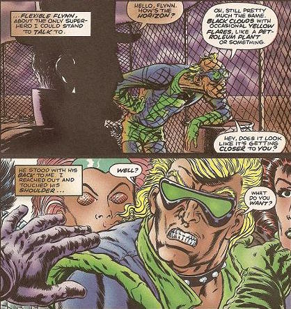 |
| Figure 974: Top: Flexible Flynn, based on Jack Cole’s Plastic Man. Bottom: Flynn after his replacement. (Written by Alan Moore, art by Don Simpson and Eric Vincent, from “In Pictopia” in Anything Goes #2, 1986) |
But in many ways it is not even the way in which it reflects on the past that makes “In Pictopia” so interesting, but rather the way in which it is ahead of its time. Its concept, after all, is not merely that superheroes are the only bits of Pictopia not to be in decline, but that the superheroes themselves are being replaced by the “new people,” such as the ones who recreationally beat a funny animal. Indeed, towards the end of the story Flexible Flynn himself is replaced with a new version – a snarling, muscle-bound brute with a studded leather collar. Given the line about how “some things just don’t fit the continuity,” one imagines Moore was referencing Crisis on Infinite Earths the way it was used to replace characters like the Curt Swan-drawn version of Superman that Moore sent off with Whatever Happened to the Man of Tomorrow with the more self-importantly serious take of John Byrne’s The Man of Steel, a title that implicitly and grimly answers Moore’s question.
Whatever Moore had in mind with this plot detail, however, it comes off as ridiculously prescient. While the trend towards darker and more “realistic” superheroes was obviously well underway in 1986, it really wasn’t until the early 90s that both Marvel and DC began aggressively revamping characters into darker alternate versions with storylines like The Death of Superman, Knightfall, and the Clone Saga. The War – particularly Watchmen – obviously has considerable responsibility for this trend, but it unquestionably lies in the future with regards to “In Pictopia.” Indeed, when Moore wrote the strip he hadn’t even begun falling out with DC. So it’s remarkable to see him write something that serves as a blistering critique of comics that wouldn’t come out for a half-decade.
Crucial to the blow’s effectiveness, however, is Don Simpson’s art, which takes the three-panel appearance of Flynn’s replacement and gives it an incredibly vivid design that looks as though it was drawn by a different artist than the earlier appearance of the original Flynn. It would be an exaggeration to say that Simpson anticipated the aesthetics of early-90s superhero design perfectly – New Flynn is still firmly a creature of the 80s. But nevertheless, it’s a design that wouldn’t have been entirely out of place in the early 90s. And moreover, the parts of the design that are the most striking are generally the ones that go beyond beyond the description Moore gives via Nocturno: “the costume was similar, but with slight modifications. The visor looked more sinister, somehow. And his face, his build they were more… well, more realistic.”
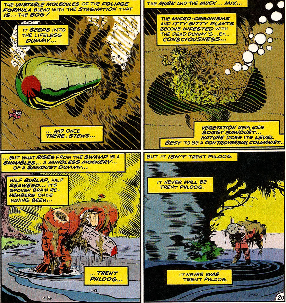 |
| Figure 975: Don Simpson satirizes Alan Moore’s Swamp Thing. (From Megaton Man #6, 1986) |
Indeed, Don Simpson is generally the secret weapon and unheralded hero of “In Pictopia” – the decisive factor that elevates it from an above-average Alan Moore short to a dark horse inclusion on a best-of-century list. Simpson was the writer and artist of Megaton Man, a broad superhero parody published by Kitchen Sink Press. Simpson and Moore had only met once, at the 1985 San Diego ComicCon, where Moore surprised the neophyte creator by being familiar with his work, then delighted him with an enthusiastic reading of Simpson’s photocopies of the forthcoming Megaton Man #6, which contained an elaborate parody of Swamp Thing, even going so far as to suggest to Simpson that Dr. Manhattan was partially based on Megaton Man. This was, to say the least, a generous suggestion on Moore’s part, but it’s easy to see why he was so enthused – Megaton Man is a wickedly funny and well-executed satire.
But however good Megaton Man is, working with Moore Simpson genuinely outdid himself. The decision to stretch Moore’s script by five pages – more than half the length of the original – wasn’t just an impressively confident move given that Simpson described the script as “like an inspired gourmet recipe (with personal asides from Julia Child),” it was a supremely generous act for an artist working for free on a benefit book who had a day job he should really be getting back to. (Kitchen Sink publisher Denis Kitchen notes that he was “not thrilled that my rival publisher Fantagraphics was getting a foot int he door” with one of his most successful creators.) But it was unquestionably the right call, allowing Simpson to default to what he describes as “a Cinemascope ‘widescreen’ panel” that put three page-width panels per page, which both served to, as Simpson puts it, “impose a steady rhythm” on the comic and to give room for the sorts of elaborate background visuals necessary to properly realize Pictopia as a setting.
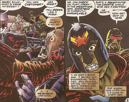 |
| Figure 976: Eric Vincent’s coloring on “In Pictopia” gave old newspaper characters a washed out and faded look, including sepia-toned speech balloons, in contrast to the cleaner colors of characters like the Judge Dredd parody. (Written by Alan Moore, art by Don Simpson, from “In Pictopia” in Anything Goes #2, 1986) |
In pursuit of these visuals (and, more prosaically, looking to save time), Simpson tapped his friends Pete Poplaski and Mike Kazaleh to help with the art, with Poplaski filling in crowd scenes of old newspaper characters and Kazaleh (who’d previously worked in animation) handling the animals of Funnytown. With Eric Vincent rounding out the art team by providing a nuanced color job that, for instance, added brown tints to the old newspaper characters “to suggest the decomposing stock of newsprint” while reverting to a “garish, almost primary color palette” when drawing characters like New Flynn, even going so far as to tint speech balloons differently based on the character’s status, the art served to thoroughly sell the idea of Pictopia as a place where a wide variety characters abut each other.
Simpson also works hard to sell one of the story’s most fundamental visual aspects, the repeated motif of grid lines, whether in the form of the segmented windows of Pictopia’s skyscrapers or the chain-link perimeter fence that characters regularly gaze through. These lines evoke the structure of the comics panel, emphasizing the way in which the characters are trapped and confined, their world slowly eroding away in the face of modernity – a cramped, paranoid feel that’s miles from the zany excess of Megaton Man, but equally distinct from the pristine dread of Dave Gibbons’s art on Watchmen.
None of this quite makes “In Pictopia” a major work, and the truth is that The Comics Journal’s inclusion of it on their century best-of list when they infamously excluded Dave Sim’s Cerebus is a self-serving perversity that’s nearly impossible to justify on any aesthetic grounds. But that bit of memorable hubris does not erase the fact that “In Pictopia” is one of the great minor works of Moore’s career – a moving and revealing counterpoint to the themes of Watchmen that speaks volumes about where his career was actually going at the time.}
The Last War in Albion is going on another hiatus while I finish the chapter. Hopefully a shorter one this time, but I’m also working on moving house right now, so while I’ll try to have something to fill the gaps on Fridays while I work to finish up the chapter, I’m afraid I make no promises. Normal service to resume sometime in the summer, and my apologies.

May 6, 2016 @ 7:57 pm
“It would be an exaggeration to say that Simpson anticipated the aesthetics of early-90s superhero design perfectly – New Flynn is still firmly a creature of the 80s. But nevertheless, it’s a design that wouldn’t have been entirely out of place in the early 90s.”
I actually felt the need to google Rob Liefeld’s career to confirm that this grimacing, mulleted figure came two years before his first published work. Astonishing.
May 7, 2016 @ 9:01 am
Well, there’s a reason that Valentino thought it necessary / morally appropriate to bring Simpson in to do parodies of Image within their first year or so; as an older, and actual reading creator, he saw the way in which his partners’ work looked like a triangulation between DESTROY!!! and Megaton Man.
Prior to this collaboration, Simpson was “cast” to be the artist on the long-gestating Convention Tension issue of Fantagraphics’ Dodgem Logic.
May 15, 2016 @ 5:42 pm
Definitely gonna hunt down In Pictopia in some form as it really does sound worth a read and the kind of piece I would get nostalgia from reading now. Really have enjoyed you covering it. Wondered when Cerebus would get a mention – and just noticed that the In Pictopia section was in parentheses!
May 15, 2016 @ 5:49 pm
In Pictopia is one of the things salvaged by Padraig O Mealoid over at glycon.livejournal.com
May 15, 2016 @ 5:44 pm
Been really getting into the current sections in The War. Still one of my favourite pieces of writing on the web. Will miss it but have a good break and hope the writing goes well Phil!
October 9, 2016 @ 3:46 am
Is this still the most recent entry? Any chance you will be resuming Last War this fall?